

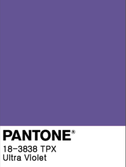
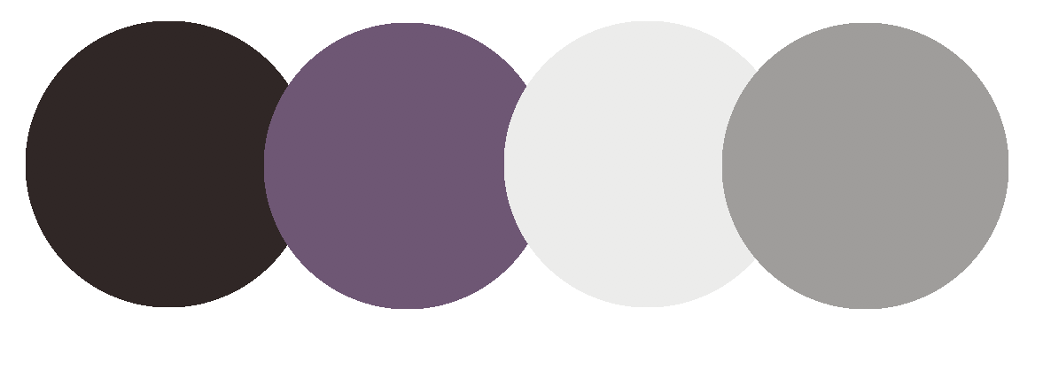
PANTONE ULTRA VIOLET 18-3838
The day is finally here! Pantone has released the 2018 Color of the Year!
Ultra Violet -18-3838
With a color so bold, it’s not uncommon for people to scoff at envisioning it as part of their daily lives. While it’s no secret that trends begin on the runways in London, Paris, and Milan, the color committee at Pantone travels to different corners of the world to study what’s up and coming, and I’m thrilled to see such a vibrant color representing 2018.
So, what does Ultra Violet represent in the world today? Pantone Vice President Laurie Pressman told The Associated Press, “We are living in complex times. We’re seeing the fear of going forward and how people are reacting to that fear. I see this as very much an optimistic color, an empowering color,”
Purple represents individuality and imagination and evokes creativity. You can expect to begin seeing more shades of violet in store-bought products, art, home décor, food, textiles, and the auto industry.
So how can you incorporate purple into your home in a tasteful manner? Here’s some inspiration for your ultra violet year:
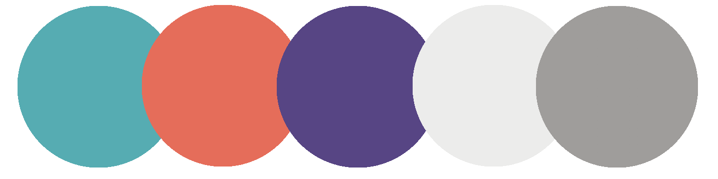
--PANTONE COLOR COMBINATION #1--

This space we designed is the perfect example of the misconception that people have when they think of incorporating violet into their home. Yes, this room is fun, adorable, and age appropriate for the little girl who calls it hers, but do you really want violet in your living room? You do. Let's take a look at some classy ways you can incorporate it into your spaces.
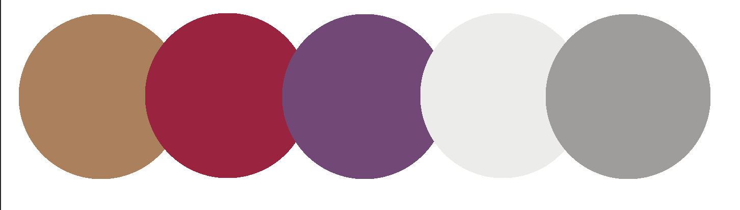
--PANTONE COLOR COMBINATION #2--

This is a Fuchsia Design classic dating all the way back to 2011. What I love about this space is that despite being 7 years old, it does not feel trendy or dated. It has the perfect mix of warm and cool tones, and I love the introduction of cranberry red to offset the violet rug. Despite having quite a bit of color in the space, it still feels sophisticated and grown up. Let's look at another room. A dining room perhaps?
--PANTONE COLOR COMBINATION #3--
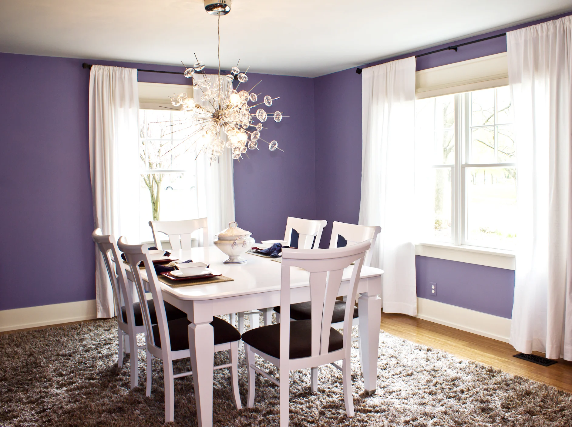
Goodness gracious - purple walls? I can't do that! That's pretty much what my client told me when I suggested it. Even after the walls were painted and the room was sitting empty, she still had her doubts. However, by balancing it with ample shades of neutral grays, the space feels rich and regal - and she now loves it!
--PANTONE COLOR COMBINATION #4--
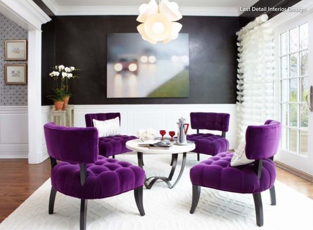

I did not personally design this gorgeous sitting room, but it was simply too good not to include. This room was designed by Last Detail Interior Design. I love how the black walls are picked up in the black furniture legs and the texture and sophistication the room has thanks to the texture in the rug, draperies, wainscoting, and tufted seating. The pop of green in the artwork is the perfect compliment to the violet chairs. The entire room is bold, elegant, and inviting.
--PANTONE COLOR COMBINATION #5--


This kids media room highlights another way to use violet by offsetting it with other shades of purple, charcoal, and white. While this is a fun space, the purple is still able to grow with the family as their kids get older.
So, while Ultra Violet might be a little bold for your taste, you can see how different shades of violet are creeping their way into home design. Would you incorporate violet into your home? Perhaps you already have. I'd love to hear your thoughts on this color trend for the year ahead!