
Mixing patterns and prints in your home can be overwhelming. Is it going to be too busy? Will the patterns ‘match’? Will it still look elevated and well-designed, or will it come across like a sugar-crazed child designed it?
The truth is - successful pattern mixing creates layers and depth in a design . There’s a lot of different ways to successfully mix prints, so here’s 10 tips and steps to elevate your home design through pattern mixing!
1. Establish a Color Palette
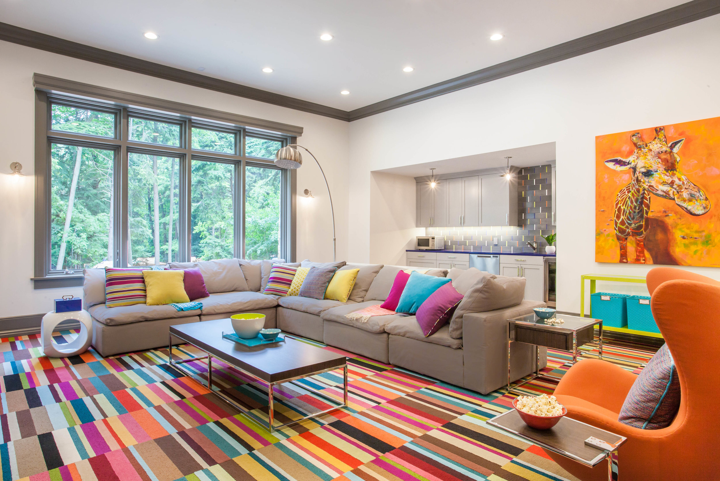
First things first, it’s important to determine what the color palette of your space is going to be, and then keep your prints and patterns within that palette. This is one thing that will keep your space from feeling ‘wild’ or getting out of control with bringing in new prints and patterns. In the case of the playroom below, we started with the carpet tiles and built the room from there. Even though the carpet is very bold and wild, we pulled similar colors and tones for the patterns found in the pillows, artwork, and even the tile backsplash at the wet bar, so it all coordinates.
In the little girl’s bedroom below, we built our color palette off of the duvet cover on the bed. I love finding one item to build a room or color palette off of. In this case, the duvet cover had little black polka dots in it, so we pulled those into the back of the built-ins and the hanging light, and then incorporated lots of pillows and accessories with different patterns in the same color palette. That being said - just keeping in the same color palette is not enough to keep a space from getting busy. Scale and balance are also important, so make sure to read tips #3 and #4 for additional ideas!

2. Don’t Be Scared of a Wall-to-Wall Bold Pattern
No matter what color palette you choose, don’t be scared to incorporate a wall-to-wall bold print or pattern just because it’s bold. If you love it - go for it! My recommendation is - always make sure the bold print is one of the first items you select, so you can be sure to balance it with smaller prints or solids and allow it to be the focal point in the space. In the nursery below, I found the wallpaper first, and built the rest of the room around it. By pairing it with lots of solid colors and smaller prints, it successfully stands as the main focal point of the room without overpowering the design.

Tall ceilings and wall-to-wall striped shiplap!? You have to be brave to commit to that, but it’s successfully pulled off in this room! Why? It’s paired with lots of solids and smaller patterns. Read on to tip #3 and #4 for more information!

3. Break up Bold Patterns with Solids
When incorporating bold patterns, it’s important to balance them with solid colored pieces. In the floral nursery in Tip #2, we paired the floral wallpaper with solid fuchsia trim (solid doesn’t have to mean boring), solid white furniture, and a solid gray rug.
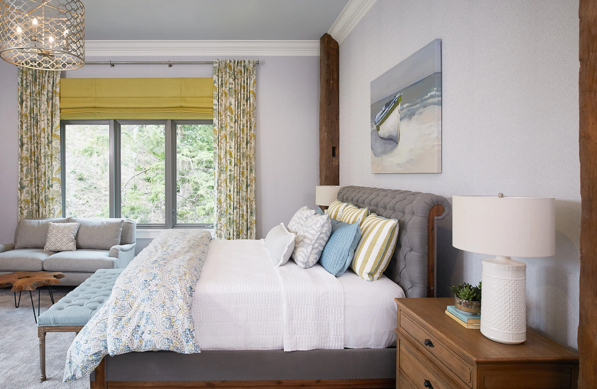
In the guest suite below, the busy floral drapes are balanced with solid citron roman shades, and the damask duvet cover and striped pillows are paired with a solid colored coverlet blanket, headboard, and bench. NOTICE that the white coverlet still has a waffle texture on it, and the solid colored bench and headboard are both tufted gifting them a tonal pattern, so while they balance the patterns, their textures still create layer and depth.

In this music room below, we wanted the tray ceiling to be a focal point, but that doesn’t mean the rest of the room had to be boring! We paired the wild Anthropologie patterned ceiling with a solid colored blue rug. Again, notice that it still has a pattern on it, but by keeping the pattern one color, it doesn’t compete with the ceiling. The draperies also have a very tonal white and yellow pattern, and because the two colors are so close to each other, they don’t compete allowing the ceiling to steal the show.

4. Vary the Scale of Different Prints and Patterns
This is an important tip - especially when working with bold patterns like the floral wallpaper below. If you’re going to mix in additional prints and patterns, the rest of the patterns don’t have to be solid tonal patterns. Just make sure you vary the scale so they don’t fight with each other. The gray rug in this nursery has a large herringbone pattern that is much larger than the flowers. Additionally, the changing pad has a polka dot pattern that is much smaller than the flowers.

These two patterns don’t compete. They are tied together using a similar color palette, but because they are a different scale, they work nicely together.

This photo shows floral wallpaper, a crocheted blanket, and an embroidered pillow all working well together because they are using different scales. It’s also good to mix free-flowing patterns (like the wallpaper) with more linear or rigid patterns (like the polka dots).

There’s a whole lotta patterns going on this room, but it works! So, let’s break down why.
The main pattern is the striped wall. It was selected first, and the rest of the space was built around it. Because the pattern, in this case, is neutral, it gives us the opportunity to mix in additional colors, so we incorporated browns and blues. The roman shade has a very small hexagon pattern and because it’s much smaller than the linear stripes, they don’t compete with each other. The same goes for the plaid chairs mixed with geometric patterned pillows. All by mixing scale, we can incorporate lots of different patterns for a layered, well-designed space.

5. Keep it Tonal
In the master suite below, the client wanted a completely black space. In order to successfully achieve this tonal concept, we had to successfully be able to mix a lot of patterns and prints - otherwise it would have been bland and boring.

This bedroom and bathroom show how by mixing a lot of different pattern scales, textures, and sheens, we were able to design a space using one single color.

6. Mix Textures and Materials
A lot of spaces, like bathrooms and kitchens, require mixing different types of surface materials thus creating a combination of hard and soft, glossy and matte, and so on and so forth. In the bathroom below, the sink vanity mixes vertical geometric tile, horizontal tonal shiplap, and an antique washed rug for a beautiful balance of hard and soft. In the shower, we mixed in a small-patterned mosaic tile on the floor paired with a subtle subway on the walls and the linear shiplap outside of the shower. By using the combination of material types, scale of patterns, and balancing with solid pieces, this bathroom is a beautifully layered design.


7. Mix Organic Patterns with Geometric Patterns
In the master bathroom in Tip #6, you can see that we combined organic patterns (in the rug) with more geometric patterns. We also did this with the watercolor floral wallpaper in the nursery paired with the herringbone rug. In the bathroom below, combining the statement hexagon floor with the earthy wood wall and mirror makes the space interesting and provides an unexpected element in the room.

This gym vestibule is another great example of mixing organic with geometric. Look how the herringbone floor pairs beautifully with the natural stone wall.
Pattern tip: if you’re creating a pattern using solid colored tile, make sure to use a contrasting grout color, so the pattern doesn’t disappear.

8. Sometimes Mixing Patterns isn’t Necessary
SOMETIMES, and only sometimes, you don’t need to mix patterns. Sometimes a space is small enough or a pattern is bold enough that it can stand alone and the space can still be beautiful and full of depth. In the men’s powder bath below, we incorporated a ‘wow’ feature with the snakeskin wallpaper. Combined with lots of rich materials (that happen to be pretty solid colored by nature), the wallpaper stands alone as the focal point in the space, and it doesn’t need other patterns to fight with.

This tip doesn’t just apply to small spaces. The hallway below is the perfect example of a single pattern being enough in a large space. The sprawling plaid tile draws your eye down the hallway, and because it is an appropriate scale (large), it’s able to stand alone as the only pattern in the room.

9. If You’re Nervous - Start Small
Mixing patterns might be overwhelming at first. If you’re nervous to start and worried it’s going to look too busy, start small with something like pillows. In the hallway below, you can see that we went with a single color palette (blue and white) and mixed all different scales, geometric, organic, and solids. By keeping them in the same blue family, they all work well together - even with the striped roman shade and antique-washed runner.

10. Hire an Interior Designer
When in doubt - hire a professional! The great thing about hiring an interior designer is they can create 3D renderings for you to see exactly what it will look like before you make any big decisions. This way, you can feel confident in your design investments before taking the plunge. The two spaces below are the perfect example of how the spaces benefit from mixing patterns on various surfaces.


Ready, Set, Go!
Ready to start in your home? What room are you thinking of tackling first?